I Love Their Dynamic.


I love their dynamic.
More Posts from Lucidmoth26 and Others
I really love it when They do Art sketches of Lore Rekindle
i absolutely loathe that the only thing truly standing between me and replicating S1/pilot era LO art perfectly is fucking phOTOSHOP

do i have access to photoshop??? yes.
do the kyle webster brushes look 10x better in photoshop than they do in clip studio??? yes.
am i willing to switch from clip studio to photoshop for all my character flatting??? idk if that's a sacrifice i'm willing to make- 😭
Animation tips 2
Got any tips for someone who wants to get into storyboarding or animation, or just any career involving drawing? 😂
I can really only speak for (television) storyboarding since that’s what I’m doing. Like I said in my last post, have a social media presence! I was hired because the showrunners liked my art style/the things I was posting on twitter(?)/tumblr(?). Because they liked my drawings, they reached out to me and asked if I was interested in testing for their show. My sense of humor managed to match theirs and my storyboards were easy to read and clear so I got the job. Again, I got lucky with that and I’m super happy they found me. My last post has a link to a helpful YouTube video~
Some general tips for people wanting to go into TV storyboarding below the cut.
Keep reading
I kinda needed this, I have and Usually use Medibang for drawlings so this helps me have a better understanding on LO and LR art style and what brushes to use
Is the pack just for clip studio or does it work for others? I use medibang myself.
They're .abr brushes so they're supported by any software that is compatible with ABR. Most of the brushes actually work best in Photoshop due to its unique brush engine (and the fact that many of them were designed for Photoshop first), but can work in both Clip Studio and Procreate as well.
Unfortunately I'm not sure if they'd work in Medibang as IIRC it relies more on a bitmap brush system similarly to IbisPaint, and converting ABR to that kind of format is a lot easier said than done (plus even if it was doable, you'd undoubtedly lose a lot of the core functionality of these brushes).
That said, if you don't have access to an ABR-compatible software, your closest equivalent to the brushes within that pack would be anything that resembles watercolor, gouache, pencil and ink, and impressionist brushes. Those are generally what a lot of those brushes are save for the pattern stamps n such, so even if you can't access those brushes specifically, I'm hoping you could find Medibang-compatible brushes that are close to the real thing so long as you look in the right places !
It is an unfortunate drawback to the nature of these brushes that they were designed for Photoshop first, it means they inevitably aren't going to work in every software. I've looked into converting them in the past but the process would just be way too extensive for me to do on my own and again, it wouldn't guarantee the brushes would even resemble their ABR versions which would defeat the point of trying to convert them in the first place 😅 Still, I hope you're able to find some Medibang equivalents using the tips I mentioned above, and if you want an ABR-compatible software that won't cost you your firstborn like Photoshop, Clip Studio's perpetual license goes on sale at least 2-3 times a year, and Procreate is still incredibly cheap on the iOS store if you have an iPad.
Sorry I couldn't be of more help! Hopefully some day Medibang will be ABR-compatible, Clip Studio wasn't always compatible with ABR either so the odds might be low but they're definitely not zero ! :'0
Sketch help
fat bodies tutorial!
ALRIGHT SO my pal @kalreyno wanted help with drawing fat characters and as a fat artist i felt like i could give a bit of helpful insight on that. there’s also been a lot of complaining about “boo hoo fat characters are hard to draw so i can’t include them in my work Ever” goin on lately so if that’s your case then this is for you too!! and also just for anyone who would like help with fat bodies in general, ofc. anyway, let’s get this show on the road!!

let’s start with some common misconceptions. these are the two main attempts at chubby bodies i run into, so i’ll focus on them.
the Anime Chubby i see everywhere, and it’s just……so wrong in many ways. first of all, there is almost no additional body fat compared to your average thin character - except for where it’s added in “attractive” places (breasts, hips, thighs). the breasts are way too perky, and don’t have the realistic shape fat would give them (though how to draw accurate breasts is another tutorial all on its own lmao). there is still a thigh gap, which usually only happens in very thin people, and bones are still visible on the surface of the skin, which also rarely happens in fat people.
the Michelin Man is better in some ways, but still not that great. it’s a slightly better attempt, but basically all that’s done there is taking a thin character and blowing them up, while giving no thought to fat distribution. the thigh gap is usually still present, and they look a lot more hard than soft - and fat is very soft and pliable.
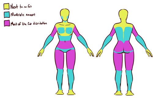
here’s a chart on how fat usually distributes (if you can’t read my messy writing, “1. next to no fat, 2. moderate amount, 3. most of the fat distribution”). basically, the more muscle an area has, the more prone it is to develop fat, such as the abdomen, thighs, and upper arms. it’s important to note that fat sits on top of muscle, and that it does distribute in different levels, and not evenly across the body as shown in the Michelin Man.
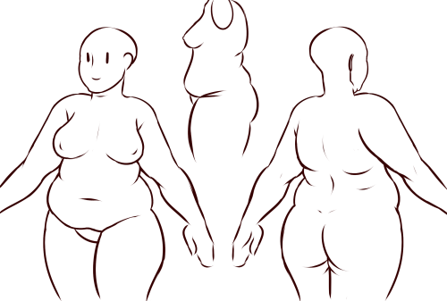
now, here’s an accurate fat body with all of that kept in mind!! notice how the fat isn’t only kept to aesthetically pleasing areas, and how it sits realistically on the character’s body. their breasts sag a lot more, which happens even in thin people with larger breasts, and the nipples are pointing more downwards than straight out. there is no thigh gap in sight, there are no bones in sight, and most importantly, they have fat rolls, which are very important in drawing a convincing fat character!! as far as i know i’ve never met a single person with no rolls at all, and everyone has them, whether thin or fat - they’re just more prominent and more consistently present in fat people. pay close attention to where they are and how they’re shaped.

here are a couple of drawings showing how fat is affected when sitting vs stretching. as seen in the first, the fat specifically on the stomach is distributed a lot more evenly and stretched out, so it becomes “flatter”. the love handles are still pretty visible, though, as well as the fat on the thighs and arms. the breasts are raised with the shoulders, and the fat on the shoulders and near the neck forms rolls as it’s being pushed together.
in the second, there is a lot less room for distribution, so the fat is all pushed together. the breasts sag and the stomach forms rolls and spills into the lap. a good analogy for the way fat works is to liken it to a water balloon, and thinking of how its shape would change when resting flat on a surface, hanging off of a ledge, held upright, etc.

here are a few extra tips i find a lot of people miss!
first on the top is the hip/pubic region. the first circle is showing the way the bellybutton is folded in fat people, as opposed to stretched out in thinner people. the second is the stomach fat spilling over onto the pubic region and creating a separation in the two areas, which is something that’s missing in a lot of art. in addition, the pubic mound also gains fat, making it round as seen in the profile drawing i did up there (i’ve heard people refer to it as fupa?). the last in the hip region is the lack of a thigh gap. i can’t stress this enough!!!! if you’re trying to draw a convincing fat character, make sure their thighs are pretty much always touching!! for reference, mine literally don’t separate until my feet are about 2ft from each other.
the bottom right is showing the double chin, which a lot of people are afraid to draw!! fat does distribute itself here too, and there’s nothing wrong with it, so don’t feel like you shouldn’t give fat characters a double chin in your work for fear of it looking like a caricature.
in the bottom middle, it’s showing how fat affects different types of breasts with the presence of more or less breast tissue.
lastly, at the very right are stretch marks with their usual locations and directions, which i also can’t stress enough!!!!! i sometimes forget to add them honestly, but they’re so important in accurately portraying fat characters, as they literally come from the skin being stretched from fat being gained (and they’re also just rlly neat lookin like why wouldn’t you lmao). some people have less and some people have more, feel free to experiment with them!

the last thing is body types!! there isn’t one single way for a person to be fat, so feel free to experiment with shapes once you’ve learned the basics!!
so there you have it, a tutorial on how to draw chubs!! now go forth and make some accurate fanart or some rad fat characters, because the world could always use more of both. hmu if you have any questions or concerns, and thanks for reading!!
EDIT: someone pointed out the bad wording in the tutorial. thank you for bringing it to my attention and sorry for offending anybody. i’ve updated the tut, so please reblog this one!
More of Belle Concept art


"Belle"- featured section from the magazine "ImagineFX" Issue 215


Belle Concept art


"Belle"- collection of concept art from "The Man Who Leapt Through Film" - part 1
Key details
How do you draw colors-of-the-rainbow characters? (I mean like characters with blue or purple or pink skin, and so on)
Do you draw them with the color of their skin and then clean it up? Or do you draw them with black, color it in, and then get rid of the outline? I'm really curious!
I use base colors and 'sculpt' the shapes out that I need, then I go over them with lineart where necessary! Usually all my base colors are on one layer unless I need to make a separate one (sometimes for hair or props I'll do it to ensure I can mess with them as much as I like without affecting the base colors but they'll usually be merged by the end). Sometimes I'll have to tweak things during the lineart stage that don't work as well as I thought they would while flatting but I've gotten pretty good at blocking out poses and proportions with flat colors, it works really well for my brain :' ) After that I shade on a clipped layer (meaning the shading won't travel outside of the base color) by using the magic wand selection tool to select what parts I want to shade at a time (again the skin and hair and clothing are all usually on one layer). I have specific colors saved in my CSP palettes for base colors, shading tones, highlight tones, etc. so it all stays pretty consistent unless we need to specifically change the coloring to match mood lighting or whatnot (and even then we won't change the coloring itself, we'll just use post-editing tricks like color balancing and effects layers!)
Here's Persephone's as an example:

And even then I actually only really use the last 6 colors (so not the first 4 from the left moving right) because some of those colors were picked from the pilot episodes that I wound up not using but kept anyways for stuff like glow effects (you should see the amount of colors I have for Hades that I don't use regularly LMAO he's gone through sooo many palette shifts through the course of LO). The three shades of pink at the far right end (going from right to left) are for her skin > skin shading and hair > hair shading, the off white color is for the whites of her eyes (and I use this color for basically every other character as well), and the dark color is for the lineart (it's not black, just a very very dark magenta). Every character has a unique color for their lineart, usually just a very dark color of their base skin tone !
No comment, But it is true
-
 dsyfunxtionalwriter liked this · 1 week ago
 -
 cromodinamica reblogged this · 3 weeks ago
 -
cromodinamica liked this · 3 weeks ago
-
 tsukimeodayooo liked this · 3 weeks ago
 -
 absolutefilth reblogged this · 3 weeks ago
 -
 honeycutt96 liked this · 3 weeks ago
 -
 peachesand-creams-world liked this · 3 weeks ago
 -
 nasty-quillz reblogged this · 3 weeks ago
 -
nasty-quillz liked this · 3 weeks ago
-
 ninfanaiade liked this · 4 weeks ago
 -
 tryna-sleep reblogged this · 4 weeks ago
 -
tryna-sleep liked this · 4 weeks ago
-
 sseaofsstarss liked this · 1 month ago
 -
 gooddesperatepuppy reblogged this · 1 month ago
 -
 ciaransaymeow liked this · 1 month ago
 -
 dollcoreenniel liked this · 1 month ago
 -
 darkchaogarden-blog reblogged this · 1 month ago
 -
 lucidmoth26 reblogged this · 1 month ago
 -
lucidmoth26 liked this · 1 month ago
-
 frostymilkalpha liked this · 1 month ago
 -
 annehairball liked this · 1 month ago
 -
 genuinefauxthought reblogged this · 1 month ago
 -
 thee-eternalprince reblogged this · 1 month ago
 -
thee-eternalprince liked this · 1 month ago
-
 venussxren liked this · 1 month ago
 -
 danzrial liked this · 1 month ago
 -
 dragora7747 liked this · 1 month ago
 -
 coollasticdabetach liked this · 1 month ago
 -
 eldritch-corgi liked this · 1 month ago
 -
darkchaogarden-blog liked this · 1 month ago
-
 dermankey liked this · 1 month ago
 -
 rockybloo reblogged this · 1 month ago
 -
 nerdy-chocomallow liked this · 2 months ago
 -
 sugerteeth liked this · 4 months ago
 -
 maxdark158 reblogged this · 4 months ago
 -
 thebladedancer1158 reblogged this · 4 months ago
 -
 little-fluffy-moth liked this · 4 months ago
 -
 xxxcany0us33m3xxx liked this · 4 months ago
 -
 star-aether liked this · 4 months ago
 -
 glitchedlad reblogged this · 4 months ago
 -
glitchedlad liked this · 4 months ago
-
 solarzilla liked this · 4 months ago
 -
 thenightmaidens liked this · 5 months ago
 -
thebladedancer1158 reblogged this · 7 months ago
-
 lez-zeppeli reblogged this · 7 months ago
 -
 studiotriggerfan397 liked this · 8 months ago
 -
 phantoticlawz liked this · 8 months ago
 -
 manekijinx liked this · 8 months ago
 -
 newavengersfan liked this · 8 months ago

Hi, I like many things from RPGs ,music, anime, drawing, and horror games
82 posts