Wip Wip Wip Wip Wip Wip


Wip wip wip wip wip wip
More Posts from Shusheerhshsheshhh and Others


Experimenting cringe stuffs on photoshop

my oc Suzi Royanol in KS style....
I wnt to make a short video about her and eliass in ks universe but thats...will ...take...ages.............
did somebody say
cute boys

🐶🐶🐶🐶🐶
Mini SAI guide - "Blending (color blending)", "Dilution (opacity mix)", and "Persistence" settings.
I’ve had a general idea what these things did but wasn’t completely sure what their specific functions were. I decided to sit down and figure it out, and I have thrown together a short reference guide for anyone who is confused about them. I know there are multiple translations of SAI floating around, so if some of these terms don’t sound familiar, just know that I’m talking about the three settings that appear under the texture in the brush tool settings (note that this won’t apply to any tool types except for brushes and watercolor brushes).
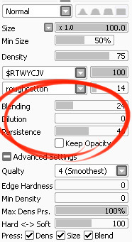
I don’t claim to be an expert so if you find I’ve made a mistake, let me know so I can update it, thanks! :3
—-
BLENDING (Color Blending)
This controls how readily the brush will inherit any colors you are painting over with it. For example, a 0% blending setting will pick up no existing colors, treating it as if you were painting on a transparent layer. A 100% blending setting will ONLY pick up existing colors (provided there are any). So at 100%, the color you’re using won’t even show up, unless you move to a transparent area. Blending is not affected by transparent pixels, so if you’re drawing on a blank layer it will have no effect.

So you can see from this example that the color I’m using gets harder to paint as the blending increases and more of the existing green is absorbed, until at 100% it is just completely turning green.
—-
DILUTION (Opacity Mix)
This controls how readily the brush will draw on a blank (transparent) part of the layer. A 0% Dilution will result in the brush painting very easily onto a blank surface, while a brush with 100% dilution will literally not paint on blank parts of the layer at all. Dilution is ONLY affected by transparent pixels. So it won’t do anything if the whole layer is already filled in (even with white). Dilution can be thought of as the inverse of the Blending setting in some ways.

So in this example, you can see that as dilution approaches 100%, the color I’m painting with basically becomes invisible. In fact, if you were to switch to binary color mode and look at this layer, there would literally be nothing there anymore!
Keep this in mind - if you ever can’t paint for some reason, check your dilution setting, it might have gotten accidentally bumped to 100!
—-
PERSISTENCE
This one goes hand-in-hand with blending. Basically, it controls how easily a brush shifts color as you are blending from one color to another. Rather, how long it “persists” if you will. Like blending, Persistence is only really relevant when painting over existing color so it’s mostly unaffected by transparent pixels. Basically, the higher the persistence, the longer it will take for the color to shift as you make a stroke, and subsequently, from which color to which other color it is shifting is dependent on the blending setting.
So for this example I’ve done the same test with three different levels of blending. I turned off all pressure sensitivity (actually I just used my mouse) to emphasize the effects in a controlled environment:

If blending is at 0%, persistence fails to have any real effect. With pressure on, there is only the difference of having to push harder, but the results will be the same as far as I can tell.

At a happy medium of 50%, persistence increase causes the orange that the brush is picking up to last longer as it goes into the green, until it never shifts to blue at all.

At 100% blending, there was never any blue in the first place, because as we already know, full blending causes you to only pick up existing color. So the persistence setting changes only how fast the orange changes to green.
Persistence is dependent upon the blending settings, so having them somewhere in the middle will probably produce the most optimal results.
—-
CONCLUSION
Ultimately how you use these is up to you, and is largely dependent on what kind of brush you’re making and what it will be used for. And most of these settings are meant to be used together in unison, so play around with them a lot!
If you are confused, or not sure what settings you want or what settings you should be using, a safe bet is to put them all at about 50% - that will produce fairly average results that are easy to work with, and it’s easy to remember in case you want to experiment but don’t want to forget your settings in case you decide to switch back.
Hope that helps!
If you want to help people affected by the explosion, I beg of you please don't donate to petitions! The government will most likely steal it because our lebanese gov is just amazing like that 😒🙃🙃
If you do want to help please donate to the red cross. Also try and find lebanese people asking you to directly help them(kofi patreon and idk what else there is). Our houses, shops, etc... Are all shattered so we need more direct donation to be able to help.
Thankfully my house wasn't affected, but there's an artist on Instagram named Audrey (@audreyghousoub)that has put up a kofi link in one of her stories to directly help her rebuild her house. That's the only person ik who needs help (well at least with money) so it would mean a lot to help her. Edit: here's the link.
Other than that, if anyone else needs help, don't hesitate to just say it! Everyone is willing to help💕 stay safe everyone!


Sketch VS Colored
I have so many colored version of this sketch, yet ain’t satisfied with any ...
Experimenting cringe stuffs on photoshop

Eager to level up

Nasa lemme design your Space suit @nasa @nasa
-
 maze-of-tones liked this · 5 years ago
 -
 shusheerhshsheshhh reblogged this · 5 years ago
