
111 posts
Latest Posts by observationsilencejoy - Page 2

Okay, I'm gonna be honest with you... Your protective Starscream is my life support now. Also your Bumble Prime on life support post is somehow giving my IDW vibes...
And now I lowkey wanna see your iteration of ghost!Bee/BP, but really don't, because my heart won't take much angst...
Oh oh OSJ...
I'm not sure how to tell you this but... Technically, that's one of the "many" routes in this au....
Coloring tutorial I guess

That's my most default shading style, a hybrid of line drawing and painted shadows, and I'll tell you exactly how to get this look. But before we start, you need a weapon This is my main brush for basically anything, including line art on days when I don't feel like switching to something actually intended for inking. It's a lightly textured square brush with color variation on every stamp. Intended for Procreate but you can always just rip the alpha texture out of the file and use it for a brush in any drawing program. That out of the way, let's go. I'll use the same line art as the one in fluff tutorial. Set the line layer to ~60 or so opacity and get to blocking in the base colors of your character. The jitter brush will introduce some color variation on it's own, but changing the color occasionally will add more visual interest.

After this I add a multiply layer on top and dab orange or red in places where we might be able to see the base of the hairs or peek at the carapace underneath.

It's places where hair parts and where it's shorter. This accent color works great on joints as well. Example of the thing I'm going for in real life:

Especially visible behind the head. It's not present on every moth to be fair, but I like to add these accents even where it wouldn't make sense, just because it looks nice. Even on insects without hair. Block in the eyes and mandibles now, best if it's on separate layer.

Now, the actual funny tricks begin. If you're one of the people who only use multiply or add blend modes, stop it, get some help Understanding the math behind blend modes is gonna get you a long way. My lineart is set to subtract more often than not. I find it produces juicier and more colorful results than multiply. I want to give this picture a warm orange feeling, so the color of my lines should be the opposite - blue.

And, subtract.

Perfect, but not quite. We can push the lines to an even softer feeling. Take the line layer, copy it, invert the color and set to multiply. I then throw gaussian blur on the resulting copy and reduce opacity until the lines bleed into the surroundings just a little bit.

On to actual shading. People who shade without getting in some background first scare me, so let me throw something together real quick.

A simple gradient will also suffice for this use. We just need some information on which colors are present in the surroundings. Copy your background, bring it on top of your character layers and gaussian blur it real hard. Set it to multiply, remove all parts of the layer that go beyond the pixels of the base color layer. Adjust opacity until the character fits in the background.

Let's identify the light sources. In this case it's only the sky, but it produces two distinct colors - soft blue lighting comes from the top, slightly stronger red comes from behind. The blue light I set to exclusion blend mode because it felt most appropriate in this case. Both add and screen looked too strong to be the light coming from such dark sky.

In this lighting context the lower part of the body will receive less light that the upper part. I use the green of the bushes set to multiply to darken the bottom.

The character is surrounded by all kinds of soft light, but it can't get everywhere. It's time to add ambient occlusion, or contact shadows, for those without a 3d background. Anywhere where there is a crevice or surfaces almost touch, a soft shadow will form.
I do it on a multiply layer with a neutral gray-green color. Gray because any color light isn't really getting in there and green because the fluff is somewhat transparent and whatever light does pass through it gains a greenish hue.

Last step, red rim light from the fading sunset behind the character.
Since it's rim light I just work with normal blending mode. Setting it to add or something of the sort would make the rim light brighter than the source of the light. And it'd be odd.
And that's it. I usually throw on some post processing in Snapseed. Pull some curves, throw on a bit of grain, etc. But it's a topic for another time.
In conclusion, try to think about the environment more when shading. What route does light go through to reach where you're coloring? Did it reflect off of any colored surface? Did it pass through something transparent to gain a different hue? What color shadow would this ambient lighting produce? Go have fun with your colors now.


gold butterfly koi ⚱️ | source

Love me some good ol' cardinal symbolism

Stop demonizing my wet babies

Against the current.
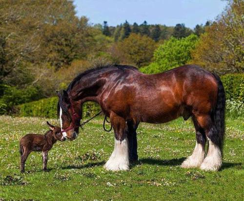
A magnificent Shire horse and his little donkey buddy (Source: https://ift.tt/2RLIbER)
Bothersome beast, comforting friend
My approach to lighting: mix and match to find out what works. I've never been great at capturing realistic lighting so I just kind of wing it 🤷♀️

the orange by wendy cope 🍊

The people have spoken, so mermaid Mabel it is
Not to worry though, I’ll probably do the reverse of both designs at some point so everyone can be happy :)

© da-da-sk
So for over a month and a half I’ve been told in my Creative writing MA class that my writing is too poetic and abstract to work in the form of a novel and that I need to simplify my meanings and sentences. I did as I was told and lost all interest in writing if I have to write in the same style that every other novelist does. Today I received this note from a classmate and didn’t realise how much I needed to hear it. Don’t change your art just because other people don’t get it. Don’t change your style to fit in with everyone else. It’s your story not theirs.

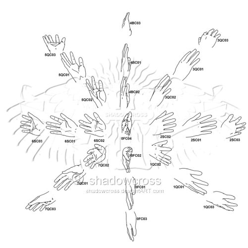


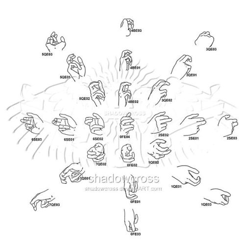
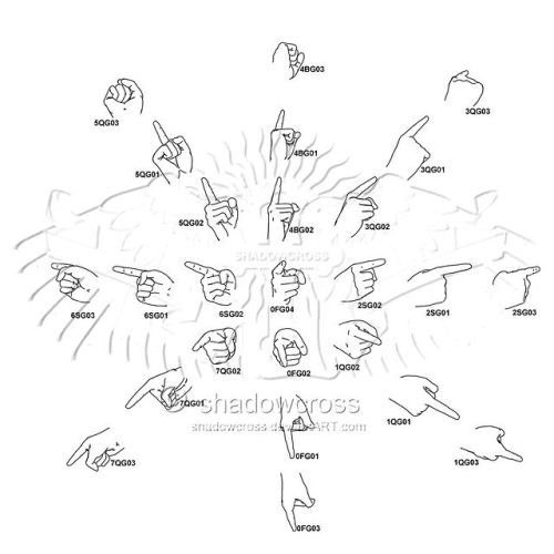
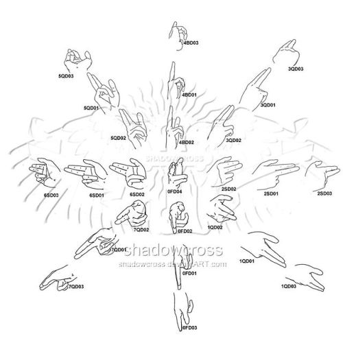
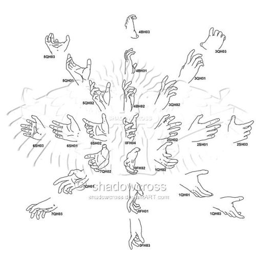
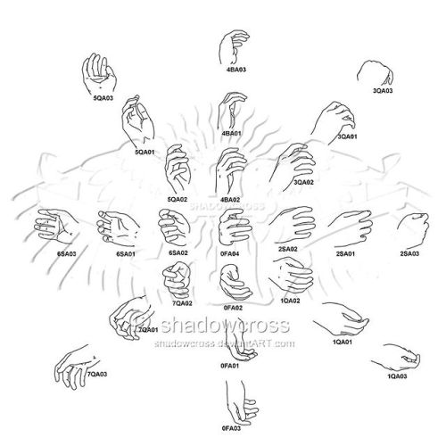
A mouth-watering fuck-ton of hand angle references.
By Shadowcross on DA.


Remembering the episode of Galavant where Kylie Minogue is The Queen of a medieval gay pub and sings this absolute bop.
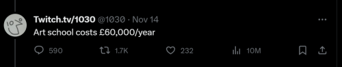
Can't afford art school?
After seeing post like this 👇
And this gem 👇
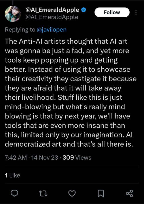
As well as countless of others from the AI generator community. Just talking about how "inaccessible art" is, I decided why not show how wrong these guys are while also helping anyone who actually wants to learn.
Here is the first one ART TEACHERS! There are plenty online and in places like youtube.
📺Here is my list:
Proko (Free)
Marc Brunet (Free but he does have other classes for a cheap price. Use to work for Blizzard)
Aaron Rutten (free)
BoroCG (free)
Jesse J. Jones (free, talks about animating)
Jesus Conde (free)
Mohammed Agbadi (free, he gives some advice in some videos and talks about art)
Ross Draws (free, he does have other classes for a good price)
SamDoesArts (free, gives good advice and critiques)
Drawfee Show (free, they do give some good advice and great inspiration)
The Art of Aaron Blaise ( useful tips for digital art and animation. Was an animator for Disney)
Bobby Chiu ( useful tips and interviews with artist who are in the industry or making a living as artist)
Second part BOOKS, I have collected some books that have helped me and might help others.
📚Here is my list:
The "how to draw manga" series produced by Graphic-sha. These are for manga artist but they give great advice and information.
"Creating characters with personality" by Tom Bancroft. A great book that can help not just people who draw cartoons but also realistic ones. As it helps you with facial ques and how to make a character interesting.
"Albinus on anatomy" by Robert Beverly Hale and Terence Coyle. Great book to help someone learn basic anatomy.
"Artistic Anatomy" by Dr. Paul Richer and Robert Beverly Hale. A good book if you want to go further in-depth with anatomy.
"Directing the story" by Francis Glebas. A good book if you want to Story board or make comics.
"Animal Anatomy for Artists" by Eliot Goldfinger. A good book for if you want to draw animals or creatures.
"Constructive Anatomy: with almost 500 illustrations" by George B. Bridgman. A great book to help you block out shadows in your figures and see them in a more 3 diamantine way.
"Dynamic Anatomy: Revised and expand" by Burne Hogarth. A book that shows how to block out shapes and easily understand what you are looking out. When it comes to human subjects.
"An Atlas of animal anatomy for artist" by W. Ellenberger and H. Dittrich and H. Baum. This is another good one for people who want to draw animals or creatures.
Etherington Brothers, they make books and have a free blog with art tips.
As for Supplies, I recommend starting out cheap, buying Pencils and art paper at dollar tree or 5 below. For digital art, I recommend not starting with a screen art drawing tablet as they are more expensive.
For the Best art Tablet I recommend either Xp-pen, Bamboo or Huion. Some can range from about 40$ to the thousands.
💻As for art programs here is a list of Free to pay.
Clip Studio paint ( you can choose to pay once or sub and get updates)
Procreate ( pay once for $9.99)
Blender (for 3D modules/sculpting, ect Free)
PaintTool SAI (pay but has a 31 day free trail)
Krita (Free)
mypaint (free)
FireAlpaca (free)
Libresprite (free, for pixel art)
Those are the ones I can recall.
So do with this information as you will but as you can tell there are ways to learn how to become an artist, without breaking the bank. The only thing that might be stopping YOU from using any of these things, is YOU.
I have made time to learn to draw and many artist have too. Either in-between working two jobs or taking care of your family and a job or regular school and chores. YOU just have to take the time or use some time management, it really doesn't take long to practice for like an hour or less. YOU also don't have to do it every day, just once or three times a week is fine.
Hope this was helpful and have a great day.

🔥🔥🔥🔥🔥
Beachcomber dies, TFcon.
Posting so other TFA fans find it on Tumblr.
Voice acting performed by @knighttimevo for Beachcomber and Shockwave for the panel in this cut scene.
ATTENTION ARTISTS OF TUMBLR
since tumblr is going to start scraping blogs to train ai be sure to glaze and nightshade your art!! Not only will both of these programs protect your art from being copied but nightshade also poisons any ai that tries to steal it
here is some more info on these tools and where you can download them:
Nightshade: Protecting Copyright (uchicago.edu)
Nightshade: Downloads (uchicago.edu)
Glaze - What is Glaze (uchicago.edu)
Glaze - Downloads (uchicago.edu)


Monster valentines day cards for your little beast
hrrrggghhhh......philosophy of art......praxis.........the idea that a certain level of complexity or a certain kind of technical skill is what qualifies something as art is bullshit.............so you have to think that way about your own art too you have to be consistent.........you have to choose how you refer to your art thoughtfully to reflect this or it will never sink into your brain..............save me jacob geller video essay "Who's Afraid of Modern Art" ............

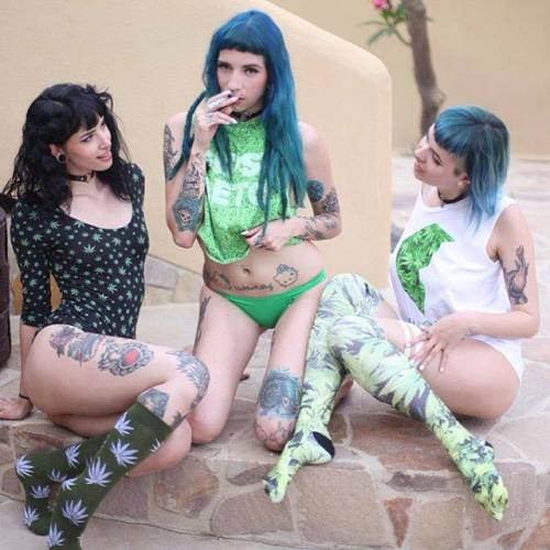
My three girlfriends. And yes, they smoke weed.
people talk about how parents who need to know every detail of their kids' lives will simply cause their children to become compulsively secretive and deceptive, but a fun fact is that sometimes it can go the other way, where the child completely abandons all their boundaries and need for privacy and habitually surrenders deeply personal information at the drop of a hat.

and that's: ✨🎉🕺 NOT good either 🕺🎉✨


Acchan #68: Cinderella