Dive into your creative stream
Data - Blog Posts


“If being human is not simply a matter of being born flesh and blood, if it is instead a way of thinking, acting and feeling, then I am hopeful that one day I will discover my own humanity. Until then, I will continue learning, changing, growing, and trying to become more than what I am.”


Nothing aggravates me more than the ‘Ask app not to track’ notification, because WHAT DO YOU MEAN I HAVE TO ASK??? I’m not knocking gently on the door, pushing it open, and saying ‘ummmm… can you maybe not take all of my data and analytics and make me feel like less of a person and more of an opportunity for capitalism?…. no…? Okay, sorry for bothering you.’ NO! I want them to NOT TRACK ME.

I am churning these out! Anyway, this is Toshiko Niwa!


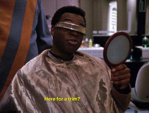
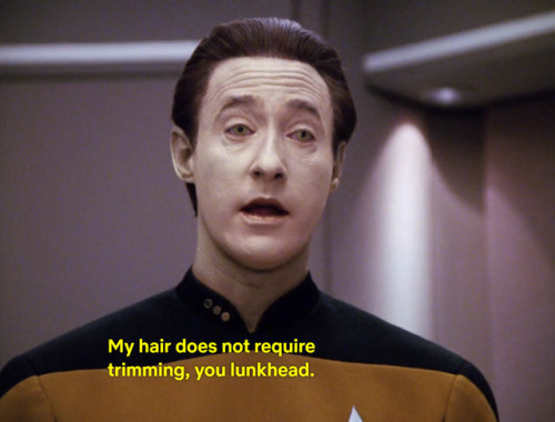
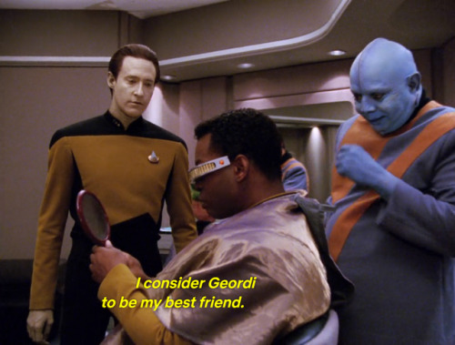
I'm watching all of Star Trek: The Next Generation and wanted to sketch
Anyways, I don't think I got the shape of his face quite right so I tried a coloring method I've never really done before
Ref photo & timelapse under the cut

I made a really bad tik tok and decided to share it with the star trek side of tumblr, sorry for making yall see this

Sing
Born: 137 AG
Died: 177 AG
Age:
40
Gender:
female
Element:
earth (metal)
Eye color:
grassy green
Hair color:
shadow black with white tips (graying)
Skin tone:
honey beige
Love interest:
Viper (secret husband:deceased)
Family:
Maylin(daughter), Mu(son), Jia(mother:deceased), Ho Tun(father:deceased), Sakura(sister:deceased), Tai(brother-in-law:deceased), Ichiro(nephew), Viper(husband:deceased), Chao(brother-in-law), Lotus(niece:deceased), Wu(nephew-in-law), Lei(grandniece), Kuei(grandnephew)
Allies:
Lin Beifong, Saikhan, Team Avatar, police force, Dragon squad, Yellowteeth Yên, Viper, Wing and Wei Beifong, Baatar Beifong Jr., etc...
Enemies:
Lu and Gang(frenemies), Tokuga, Triple Threat Triad, Guan, Pòsuì, triads, Lightning Bolt Zolt(formerly)
When you find two fictional characters from a popular show that obviously have a romantic/sexual tension and great chemistry, so you search the internet and there is next to no mention of them, no fan art and no fanfics on AO3…
Everyone (Even You!) Can Use Satellite Data
At NASA we’re pretty great at putting satellites and science instruments into orbit around Earth. But it turns out we’re also pretty great at showing people how to get and use all that data.
One of the top ways you can learn how to use NASA data is our ARSET program. ARSET is our Applied Remote Sensing Training program and it helps people build skills that integrate all these Earth science data into their decision making.

ARSET will train you on how to use data from a variety of Earth-observing satellites and instruments aboard the International Space Station.
Once you take a training, you’ll be in GREAT company because thousands of people have taken an ARSET training.

We hold in person and online trainings to people around the world, showing them how to use NASA Earth science data. Trainings are offered in air quality, climate, disaster, health, land, water resources and wildfire management.
For example, if you’re trying to track how much fresh drinking water there is in your watershed, you can take an ARSET training and learn how to find satellite data on how much precipitation has fallen over a certain time period or even things like the ‘moistness’ of soil and the quality of the water.

Best yet, all NASA Earth observing data is open and freely available to the whole world! That’s likely one of the reasons we’ve had participants from 172 of the approximately 190 countries on Earth.

Since its beginning 10 years ago, ARSET has trained more than 30 thousand people all over the world. They’ve also worked with people from more than 7,500 different organizations and that includes government agencies, non-profit groups, advocacy organizations, private industry.
And even though 2019 is ARSET’s 10th birthday – we’ve only just begun. Every year about 60% of the organizations and agencies we train are new to the program. We’re training just about anyone who is anyone doing Earth science on Earth!
Join us, learn more about how we train people to use Earth observing data here, and heck, you can even take a training yourself: https://arset.gsfc.nasa.gov/.
Make sure to follow us on Tumblr for your regular dose of space: http://nasa.tumblr.com
Global Temperature by the Numbers
The Year
4th Hottest
2018 was the fourth hottest year since modern recordkeeping began. NASA and the National Oceanic and Atmospheric Administration work together to track temperatures around the world and study how they change from year to year. For decades, the overall global temperature has been increasing.

Over the long term, world temperatures are warming, but each individual year is affected by things like El Niño ocean patterns and specific weather events.
1.5 degrees
Globally, Earth’s temperature was more than 1.5 degrees Fahrenheit warmer than the average from 1951 to 1980.

The Record
139 years
Since 1880, we can put together a consistent record of temperatures around the planet and see that it was much colder in the late-19th century. Before 1880, uncertainties in tracking global temperatures were too large. Temperatures have increased even faster since the 1970s, the result of increasing greenhouse gases in the atmosphere.

Five Hottest
The last five years have been the hottest in the modern record.

6,300 Individual Observations
Scientists from NASA use data from 6,300 weather stations and Antarctic research stations, together with ship- and buoy-based observations of sea surface temperatures to track global temperatures.

The Consequences
605,830 swimming pools
As the planet warms, polar ice is melting at an accelerated rate. The Greenland and Antarctic ice sheets lost about 605,830 Olympic swimming pools (400 billion gallons) of water between 1993 and 2016.

8 inches
Melting ice raises sea levels around the world. While ice melts into the ocean, heat also causes the water to expand. Since 1880, sea levels around the world have risen approximately 8 inches.

71,189 acres burned
One symptom of the warmer climate is that fire seasons burn hotter and longer. In 2018, wildfires burned more than 71,189 acres in the U.S. alone.

46% increase in CO2 levels
CO2 levels have increased 46 percent since the late 19th Century, which is a dominant factor causing global warming.

The Sun is not silent. The low, pulsing hum of our star's heartbeat allows scientists to peer inside, revealing huge rivers of solar material flowing around before their eyes — er, ears.
Data from ESA (European Space Agency) and NASA’s Solar and Heliospheric Observatory (SOHO), sonified by the Stanford Experimental Physics Lab, captures the Sun’s natural vibrations and reveals what can’t be seen with the naked eye.
In this audiogram, our heliophysicist Alex Young explains how this simple sound connects us with the Sun and all the other stars in the universe.
This piece features low frequency sounds of the Sun. For the best listening experience, listen to this story with headphones. 🎧
Read more: https://go.nasa.gov/2LMW42o
Make sure to follow us on Tumblr for your regular dose of space: http://nasa.tumblr.com.
5 Examples of How Our Satellite Data is Helping the Planet
We could talk all day about how our satellite data is crucial for Earth science…tracking ocean currents, monitoring natural disasters, soil mapping – the list goes on and on.
But did you know there is another way this data can improve life here on Earth?

Our satellite data can be used to build businesses and commercial products – but finding and using this data has been a daunting task for many potential users because it’s been stored across dozens of websites.
Until now.
Our Technology Transfer program has just released their solution to make finding data easier, called The NASA Remote Sensing Toolkit (RST).

RST offers an all-in-one approach to finding and using our Earth Science data, the tools needed to analyze it, and software to build your own tools.
Before, we had our petabytes on petabytes of information spread out across dozens of websites – not to mention the various software tools needed to interpret the data.

Now, RST helps users find everything they need while having only one browser open.
Feeling inspired to innovate with our data? Here are just a few examples of how other companies have taken satellite data and turned it into products, known as NASA spinoffs, that are helping our planet today.
1. Bringing Landscape into Focus

We have a number of imaging systems for locating fires, but none were capable of identifying small fires or indicating the flames’ intensity. Thanks to a series of Small Business Innovation Research (SBIR) contracts between our Ames Research Center and Xiomas Technologies LLC, the Wide Area Imager aerial scanner does just that. While we and the U.S. Forest Service use it for fire detection, the tool is also being used by municipalities for detailed aerial surveillance projects.
2. Monitoring the Nation’s Forests with the Help of Our Satellites

Have you ever thought about the long-term effects of natural disasters, such as hurricanes, on forest life? How about the big-time damage caused by little pests, like webworms?
Our Stennis Space Center did, along with multiple forest services and environmental threat assessment centers. They partnered to create an early warning system to identify, characterize, and track disturbances from potential forest threats using our satellite data. The result was ForWarn, which is now being used by federal and state forest and natural resource managers.
3. Informing Forecasts of Crop Growth

Want to hear a corny story?
Every year Stennis teams up with the U.S. Department of Agriculture to host a program called Ag 20/20 to utilize remote sensing technology for operational use in agricultural crop management practices at the level of individual farms. During Ag 20/20 in 2000, an engineering contractor developed models for using our satellite data to predict corn crop yield. The model was eventually sold to Genscape Inc., which has commercialized it as LandViewer. Sold under a subscription model, LandViewer software provides predictions of corn production to ethanol plants and grain traders.
4. Water Mapping Technology Rebuilds Lives in Arid Regions

No joking around here. Lives depend on the ability to find precious water in areas with little of it.
Using our Landsat satellite and other topographical data, Radar Technologies International developed an algorithm-based software program that can locate underground water sources. Working with international organizations and governments, the firm is helping to provide water for refugees and other people in drought-stricken regions such as Kenya, Sudan, and Afghanistan.
5. Satellite Maps Deliver More Realistic Gaming

Are you more of the creative type? This last entry used satellite data to help people really get into their gameplay.
When Electronic Arts (EA) decided to make SSX, a snowboarding video game, it faced challenges in creating realistic-looking mountains. The solution was our ASTER Global Digital Elevation Map, made available by our Jet Propulsion Laboratory, which EA used to create 28 real-life mountains from 9 different ranges for its award-winning game.
You can browse our Remote Sensing Toolkit at technology.nasa.gov.
Want to know more about future tutorial webinars on RST?
Follow our Technology Transfer Program on twitter @NASAsolutions for the latest updates.
Want to learn more about the products made by NASA technologies? Head over to spinoff.nasa.gov.
Sign up to receive updates about upcoming tutorials HERE.
Make sure to follow us on Tumblr for your regular dose of space: http://nasa.tumblr.com.
2017 Was One of Our Planet’s Hottest Years on Record

We just finished the second hottest year on Earth since global temperature estimates first became feasible in 1880. Although 2016 still holds the record for the warmest year, 2017 came in a close second, with average temperatures 1.6 degrees Fahrenheit higher than the mean.

2017’s temperature record is especially noteworthy, because we didn’t have an El Niño this year. Often, the two go hand-in-hand.
El Niño is a climate phenomenon that causes warming of the tropical Pacific Ocean waters, which affect wind and weather patterns around the world, usually resulting in warmer temperatures globally. 2017 was the warmest year on record without an El Niño.

We collect the temperature data from 6,300 weather stations and ship- and buoy-based observations around the world, and then analyze it on a monthly and yearly basis. Researchers at the National Oceanic and Atmospheric Administration (NOAA) do a similar analysis; we’ve been working together on temperature analyses for more than 30 years. Their analysis of this year’s temperature data tracks closely with ours.

The 2017 temperature record is an average from around the globe, so different places on Earth experienced different amounts of warming. NOAA found that the United States, for instance, had its third hottest year on record, and many places still experienced cold winter weather.

Other parts of the world experienced abnormally high temperatures throughout the year. Earth’s Arctic regions are warming at roughly twice the rate of the rest of the planet, which brings consequences like melting polar ice and rising sea levels.

Increasing global temperatures are the result of human activity, specifically the release of greenhouse gases like carbon dioxide and methane. The gases trap heat inside the atmosphere, raising temperatures around the globe.

We combine data from our fleet of spacecraft with measurements taken on the ground and in the air to continue to understand how our climate is changing. We share this important data with partners and institutions across the U.S. and around the world to prepare and protect our home planet.
Earth’s long-term warming trend can be seen in this visualization of NASA’s global temperature record, which shows how the planet’s temperatures are changing over time, compared to a baseline average from 1951 to 1980.
Learn more about the 2017 Global Temperature Report HERE.
Discover the ways that we are constantly monitoring our home planet HERE.
Make sure to follow us on Tumblr for your regular dose of space: http://nasa.tumblr.com.
What Scientists Are Learning from the Eclipse
While millions of people in North America headed outside to watch the eclipse on Aug. 21, 2017, hundreds of scientists got out telescopes, set up instruments, and prepared balloon launches – all so they could study the Sun and its complicated influence on Earth.

Total solar eclipses happen about once every 18 months somewhere in the world, but the August eclipse was rare because of its long path over land. The total eclipse lasted more than 90 minutes over land, from when it first reached Oregon to when it left the U.S. in South Carolina.

This meant that scientists could collect more data from land than during most eclipses, giving us new insight into our world and the star that powers it.
A moment in the Sun’s atmosphere
During a total solar eclipse, the Sun’s outer atmosphere, the corona, is visible from Earth. It’s normally too dim to see next to the Sun’s bright face, but, during an eclipse, the Moon blocks out the Sun, revealing the corona.

Image Credit: Peter Aniol, Miloslav Druckmüller and Shadia Habbal
Though we can study parts of the corona with instruments that create artificial eclipses, some of the innermost regions of the corona are only visible during total solar eclipses. Solar scientists think this part of the corona may hold the secrets to some of our most fundamental questions about the Sun: Like how the solar wind – the constant flow of magnetized material that streams out from the Sun and fills the solar system – is accelerated, and why the corona is so much hotter than the Sun’s surface below.
Depending on where you were, someone watching the total solar eclipse on Aug. 21 might have been able to see the Moon completely obscuring the Sun for up to two minutes and 42 seconds. One scientist wanted to stretch that even further – so he used a pair of our WB-57 jets to chase the path of the Moon’s shadow, giving their telescopes an uninterrupted view of the solar corona for just over seven and half minutes.

These telescopes were originally designed to help monitor space shuttle launches, and the eclipse campaign was their first airborne astronomy project!

These scientists weren’t the only ones who had the idea to stretch out their view of the eclipse: The Citizen CATE project (short for Continental-America Telescopic Eclipse) did something similar, but with the help of hundreds of citizen scientists.
Citizen CATE included 68 identical small telescopes spread out across the path of totality, operated by citizen and student scientists. As the Moon’s shadow left one telescope, it reached the next one in the lineup, giving scientists a longer look at the way the corona changes throughout the eclipse.

After accounting for clouds, Citizen CATE telescopes were able to collect 82 minutes of images, out of the 93 total minutes that the eclipse was over the US. Their images will help scientists study the dynamics of the inner corona, including fast solar wind flows near the Sun’s north and south poles.
The magnetized solar wind can interact with Earth’s magnetic field, causing auroras, interfering with satellites, and – in extreme cases – even straining our power systems, and all these measurements will help us better understand how the Sun sends this material speeding out into space.
Exploring the Sun-Earth connection
Scientists also used the eclipse as a natural laboratory to explore the Sun’s complicated influence on Earth.
High in Earth’s upper atmosphere, above the ozone layer, the Sun’s intense radiation creates a layer of electrified particles called the ionosphere. This region of the atmosphere reacts to changes from both Earth below and space above. Such changes in the lower atmosphere or space weather can manifest as disruptions in the ionosphere that can interfere with communication and navigation signals.

One group of scientists used the eclipse to test computer models of the ionosphere’s effects on these communications signals. They predicted that radio signals would travel farther during the eclipse because of a drop in the number of energized particles. Their eclipse day data – collected by scientists spread out across the US and by thousands of amateur radio operators – proved that prediction right.
In another experiment, scientists used the Eclipse Ballooning Project to investigate the eclipse’s effects lower in the atmosphere. The project incorporated weather balloon flights from a dozen locations to form a picture of how Earth’s lower atmosphere – the part we interact with and which directly affects our weather – reacted to the eclipse. They found that the planetary boundary layer, the lowest part of Earth’s atmosphere, actually moved closer to Earth during the eclipse, dropped down nearly to its nighttime altitude.

A handful of these balloons also flew cards containing harmless bacteria to explore the potential for contamination of other planets with Earth-born life. Earth’s stratosphere is similar to the surface of Mars, except in one main way: the amount of sunlight. But during the eclipse, the level of sunlight dropped to something closer to what you’d expect to see on Mars, making this the perfect testbed to explore whether Earth microbes could hitch a ride to the Red Planet and survive. Scientists are working through the data collected, hoping to build up better information to help robotic and human explorers alike avoid carrying bacterial hitchhikers to Mars.

Image: The small metal card used to transport bacteria.
Finally, our EPIC instrument aboard NOAA’s DSCOVR satellite provided awe-inspiring views of the eclipse, but it’s also helping scientists understand Earth’s energy balance. Earth’s energy system is in a constant dance to maintain a balance between incoming radiation from the Sun and outgoing radiation from Earth to space, which scientists call the Earth’s energy budget. The role of clouds, both thick and thin, is important in their effect on energy balance.

Like a giant cloud, the Moon during the total solar eclipse cast a large shadow across a swath of the United States. Scientists know the dimensions and light-blocking properties of the Moon, so they used ground- and space-based instruments to learn how this large shadow affects the amount of sunlight reaching Earth’s surface, especially around the edges of the shadow. Measurements from EPIC show a 10% drop in light reflected from Earth during the eclipse (compared to about 1% on a normal day). That number will help scientists model how clouds radiate the Sun’s energy – which drives our planet’s ocean currents, seasons, weather and climate – away from our planet.
For even more eclipse science updates, stay tuned to nasa.gov/eclipse.
Make sure to follow us on Tumblr for your regular dose of space: http://nasa.tumblr.com.

In temperatures that drop below -20 degrees Fahrenheit, along a route occasionally blocked by wind-driven ice dunes, a hundred miles from any other people, a team led by two of our scientists are surveying an unexplored stretch of Antarctic ice.
They’ve packed extreme cold-weather gear and scientific instruments onto sleds pulled by two tank-like snow machines called PistenBullys, and after a stop at the South Pole Station (seen in this image), they began a two- to three-week traverse.
The 470-mile expedition in one of the most barren landscapes on Earth will ultimately provide the best assessment of the accuracy of data collected from space by the Ice Cloud and land Elevation Satellite-2 (ICESat-2), set to launch in 2018.
This traverse provides an extremely challenging way to assess the accuracy of the data. ICESat-2’s datasets are going to tell us incredible things about how Earth’s ice is changing, and what that means for things like sea level rise.
Make sure to follow us on Tumblr for your regular dose of space: http://nasa.tumblr.com.
From Microscopic to Multicellular: Six Stories of Life that We See from Space
Life. It's the one thing that, so far, makes Earth unique among the thousands of other planets we've discovered. Since the fall of 1997, NASA satellites have continuously and globally observed all plant life at the surface of the land and ocean. During the week of Nov. 13-17, we are sharing stories and videos about how this view of life from space is furthering knowledge of our home planet and the search for life on other worlds.

Earth is the only planet with life, as far as we know. From bacteria in the crevices of the deepest oceans to monkeys swinging between trees, Earth hosts life in all different sizes, shapes and colors. Scientists often study Earth from the ground, but some also look to our satellites to understand how life waxes and wanes on our planet.
Over the years, scientists have used this aerial view to study changes in animal habitats, track disease outbreaks, monitor forests and even help discover a new species. While this list is far from comprehensive, these visual stories of bacteria, plants, land animals, sea creatures and birds show what a view from space can reveal.
1. Monitoring the single-celled powerhouses of the sea

Known as the grass of the ocean, phytoplankton are one of the most abundant types of life in the ocean. Usually single-celled, these plant-like organisms are the base of the marine food chain. They are also responsible for the only long-term transfer of carbon dioxide from Earth’s atmosphere to the ocean.
Even small changes in phytoplankton populations can affect carbon dioxide concentrations in the atmosphere, which could ultimately affect Earth’s global surface temperatures. Scientists have been observing global phytoplankton populations continuously since 1997 starting with the Sea-Viewing Wide Field-of View Sensor (SeaWiFS). They continue to study the small life-forms by satellite, ships and aircrafts.
2. Predicting cholera bacteria outbreaks
Found on the surface of zooplankton and in contaminated water, the bacteria that cause the infectious disease cholera — Vibrio cholerae — affect millions of people every year with severe diarrhea, sometimes leading to death. While our satellite sensors can’t detect the actual bacteria, scientists use various satellite data to look for the environmental conditions that the bacteria thrive in.
Specifically, microbiologist Rita Colwell at the University of Maryland, College Park, and West Virginia University hydrologist Antar Jutla studied data showing air and ocean temperature, salinity, precipitation, and chlorophyllconcentrations, the latter a marker for zooplankton. Anticipating where the bacteria will bloom helps researchers to mitigate outbreaks.

Recently, Colwell and Jutla have been able to estimate cholera risk after major events, such as severe storms, by looking at satellite precipitation data, air temperature, and population maps. The two maps above show the team's predicted cholera risk in Haiti two weeks after Hurricane Matthew hit over October 1-2, 2016 and the actual reported cholera cases in October 2016.
3. Viewing life on land
From helping preserve forests for chimpanzees to predicting deer population patterns, scientists use our satellites to study wildlife across the world. Satellites can also see the impacts of perhaps the most relatable animal to us: humans. Every day, we impact our planet in many ways including driving cars, constructing buildings and farming – all of which we can see with satellites.

Our Black Marble image provides a unique view of human activity. Looking at trends in our lights at night, scientists can study how cities develop over time, how lighting and activity changes during certain seasons and holidays, and even aid emergency responders during power outages caused by natural disasters.
4. Tracking bird populations
Scientists use our satellite data to study birds in a variety of ways, from understanding their migratory patterns, to spotting potential nests, to tracking populations. In a rather creative application, scientists used satellite imagery to track Antarctica’s emperor penguin populations by looking for their guano – or excrement.

Counting emperor penguins from the ground perspective is challenging because they breed in some of the most remote and cold places in the world, and in colonies too large to easily count manually. With their black and white coats, emperor penguins are also difficult to count from an aerial view as they sometimes blend in with shadows on the ice. Instead, Phil Trathan and his colleagues at the British Antarctic Survey looked through Landsat imagery for brown stains on the sea ice. By looking for penguin droppings, Trathan said his team identified 54 emperor penguin colonies along the Antarctic coast.
5. Parsing out plant life
Just as we see plants grow and wilt on the ground, satellites observe the changes from space. Flourishing vegetation can indicate a lively ecosystem while changes in greenery can sometimes reveal natural disasters, droughts or even agricultural practices. While satellites can observe plant life in our backyards, scientists can also use them to provide a global picture.

Using data from satellites including SeaWiFS, and instruments including the NASA/NOAA Visible Infrared Imaging Radiometer Suite and the Moderate Resolution Imaging Spectroradiometer, scientists have the most complete view of global biology to date, covering all of the plant life on land and at the surface of the ocean.
6. Studying life under the sea
Our satellites have helped scientists study creatures living in the oceans whether it’s finding suitable waters for oysters or protecting the endangered blue whale. Scientists also use the data to learn more about one of the most vulnerable ecosystems on the planet – coral reefs.

They may look like rocks or plants on the seafloor, but corals are very much living animals. Receiving sustenance from photosynthetic plankton living within their calcium carbonate structures, coral reefs provide food and shelter for many kinds of marine life, protect shorelines from storms and waves, serve as a source for potential medicines, and operate as some of the most diverse ecosystems on the planet.

However, coral reefs are vulnerable to the warming of the ocean and human activity. Our satellites measure the surface temperature of ocean waters. These measurements have revealed rising water temperatures surrounding coral reef systems around the world, which causes a phenomenon known as “coral bleaching.” To add to the satellite data, scientists use measurements gathered by scuba divers as well as instruments flown on planes.
During the week of Nov. 13-17, check out our stories and videos about how this view of life from space is furthering knowledge of our home planet and the search for life on other worlds. Follow at www.nasa.gov/Earth.
Make sure to follow us on Tumblr for your regular dose of space: http://nasa.tumblr.com.
Launching the Future of Space Communications
Our newest communications satellite, named the Tracking and Data Relay Satellite-M or TDRS-M, launches Aug. 18 aboard an Atlas V rocket from our Kennedy Space Center in Florida. It will be the 13th TDRS satellite and will replenish the fleet of satellites supporting the Space Network, which provides nearly continuous global communications services to more than 40 of our missions.

Communicating from space wasn’t always so easy. During our third attempt to land on the moon in 1970, the Apollo 13 crew had to abort their mission when the spacecraft’s oxygen tank suddenly exploded and destroyed much of the essential equipment onboard. Made famous in the movie ‘Apollo 13’ by Ron Howard and starring Tom Hanks, our NASA engineers on the ground talked to the crew and fixed the issue. Back in 1970 our ground crew could only communicate with their ground teams for 15 percent of their orbit – adding yet another challenge to the crew. Thankfully, our Apollo 13 astronauts survived and safely returned to Earth.

Now, our astronauts don’t have to worry about being disconnected from their teams! With the creation of the TDRS program in 1973, space communications coverage increased rapidly from 15 percent coverage to 85 percent coverage. And as we’ve continued to add TDRS spacecraft, coverage zoomed to over 98 percent!

TDRS is a fleet of satellites that beam data from low-Earth-orbiting space missions to scientists on the ground. These data range from cool galaxy images from the Hubble Space Telescope to high-def videos from astronauts on the International Space Station! TDRS is operated by our Space Network, and it is thanks to these hardworking engineers and scientists that we can continuously advance our knowledge about the universe!

What’s up next in space comm? Only the coolest stuff ever! LASER BEAMS. Our scientists are creating ways to communicate space data from missions through lasers, which have the ability to transfer more data per minute than typical radio-frequency systems. Both radio-frequency and laser comm systems send data at the speed of light, but with laser comm’s ability to send more data at a time through infrared waves, we can receive more information and further our knowledge of space.

How are we initiating laser comm? Our Laser Communications Relay Demonstration is launching in 2019! We’re only two short years away from beaming space data through lasers! This laser communications demo is the next step to strengthen this technology, which uses less power and takes up less space on a spacecraft, leaving more power and room for science instruments.

Watch the TDRS launch live online at 8:03 a.m. EDT on Aug. 18: https://www.nasa.gov/nasalive
Join the conversation on Twitter: @NASA_TDRS and @NASALasercomm!
Make sure to follow us on Tumblr for your regular dose of space: http://nasa.tumblr.com
Scientists are trying a new, interactive way to understand ocean current data with the help of high-resolution global ocean simulations. In the part of the global visualization shown, the Gulf Stream features prominently. Surface water speeds are shown ranging from 0 meters per second (dark blue) to 1.23 meters per second (cyan).
This video is running at one simulation day per second. A team from our Advanced Supercomputing (NAS) facility at our Ames Research Center has developed a new visualization tool that is being used by researchers to study the behavior of ocean currents. The new visualization tool provides high-resolution views of the entire globe at once, allowing the scientists to see new details that they had missed in previous analyses of their simulation, which was run on our Pleiades supercomputer.
For more information, visit: https://www.nasa.gov/feature/ames/scientists-explore-ocean-currents-through-supercomputer-simulations
Make sure to follow us on Tumblr for your regular dose of space: http://nasa.tumblr.com